In this post I will show:
- Step-by-step overview of how motion charts work.
- An example of how I used Google Analytics motion charts to figure out which keyword to spend money on.
Note (I could have got similar information from a few reports in Google Analytics, but motions charts just made it easier and faster).
Let’s get started
To access motion charts,
- Click on your report (keywords report in this case).
- Select the date range that you want to analyze.
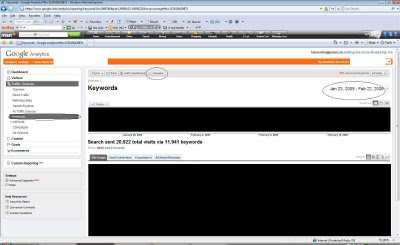
- Click on Visualize button on the top. This will bring the motion chart (see below).
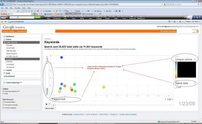
In the motion charts interface you can choose up to four dimensions that you can plot your data point against and see it in this graph. The four dimension areas are circled in the image below. Two dimensions can be plotted on the chart on X-axis and Y-axis, one using the color and the fourth using the size of the bubble that represents the data point.
For the dimensions on X-Axis and Y-Axis you have the option to plot the data either on “Linear” or “Log” scale. I chose linear in this case. (Note: You should choose log when your data points have too much variations in their values from one day to another. Using a linear scale will make it hard to draw them on one chart but log scale will make the chart much cleaner.)
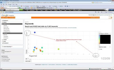
You can select the dimensions by clicking on appropriate section (see below)

After you have selected your dimensions and chosen the scale (log or linear) you want, click on the data points (bubbles in the middle of the chart) to show the name of the data point. Also, those data points are will be tracked when the “Trails” option is enabled (discussed below).
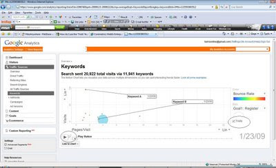
Once all your selections are done you can check the “Trails” check box to track the progression of each data point on each of the dimensions you selected over the time period that you selected. Even though “Trails” is optional, I have found it to be an important feature to explore the full power of motion charts.
Note: if you select too many bubbles (keywords in this case) along with “Trails” then the motion charts become very crowded. You should limit selection to no more than 3 bubbles at a time.
In this case I chose two keywords, Keyword A and Keyword B since I wanted to see how they compare to each other on the dimensions that I chose. (Actual keywords are disguised for this example).
So why did I choose those two keywords? I actually chose a lot of keyword combinations. I was trying to find the keywords which I should buy on search engines to drive more traffic. Since the budget is limited (isn’t that the case everywhere?) I had to pick the keywords that will give us the biggest bang for our buck.
This site had two main site goals:
- Convert visitors to registered members (Registration).
- Drive more page views/visit to increase the ad inventory and hence ad revenue.
Based on these goals we needed to see following metrics:
- Conversions driven by keywords
- Visits Driven by Keywords
- Page views/Visit
- Bounce Rate
Since both the keywords had about same conversion rate, it was not important for us to plot it on X and Y-axis and it was chosen to be represented by the bubble size. I plotted metrics 1 and 2 (see above) on Y-axis and X-axis respectively since I wanted to see how the traffic is driven and how many pages people view when they visit the site. Bounce Rate was chosen to show different colors.
In my option, any critical metrics should go on X-axis and Y-axis. You should play with plotting all different metrics on different axis, color and size to see which one provide you more meaningful view. Plotting them in different ways provide different views and ideas of additional metrics that you might want to look at.
After all the dimension selections were made, I checked the “Trails” option and hit the “Play” button to see the motion chart in action (You can also manually move the slider next to play button).
Here is the final Motion Chart:
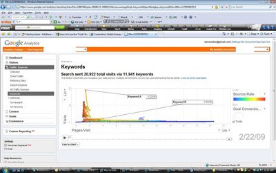
Looking at this it is clear that Keyword A is driving more traffic but lower Pages/Visit than Keyword B. The bounce rate is also higher for keyword A. The conversion rate is about the same for both keywords.
It is clear that we should put more dollars behind Keyword B as it helps us achieve goal number 2 better than Keyword A. Goal 1 is about the same for both these keywords.
Hope this post was helpful in demystifying Google Analytics Motion Charts.
For any questions on Motion Charts and Google Analytics please visit Ask an Expert section on my site.
Comments? Questions?
----------------------------------------------------------------------------
Looking to fill your Web Analytics or Online Marketing position?Post your open jobs on http://www.web-analytics-jobs.com/
Sr/Lead Analytic Warehouse/Java Engineer at Saas Company In the SF Bay Area (Emeryville, CA)
----------------------------------------------------------------------------
Site: AnilBatra.com
Twitter: http://www.twitter.com/anilbatra
This is very helpful - thanks!
ReplyDeleteHow do I narrow down the field so that I see only the keywords I want? Right now it shows me 10 keywords and I can't figure how to select only 1 or 2 so that I can focus.
Also - daily variations are not as useful as weekly (for visits) because of certain weekdays usually having higher Internet traffic anyway. How can I see this on a weekly basis?
I have not been able to find a way to narrow down so that I can choose the keywords I want.
ReplyDeleteAlso, I am not able to find how to change the time frame.
Will let you know if I am able to find a solution.
great post! This was the first walk-through I've seen that actually explained all the options and why they're important. It inspired me to go learn motion charts. glad I found this!
ReplyDelete