Some validation put unnecessary formatting burden on your customer/visitor leading them to abandon your forms and go to your competitors. A lot of data formatting can be done via client side JavaScript or backend processing without putting the customer through a lot of pain. I am not suggesting to remove all required data and data formatting requirement, all I am saying is that be if you can handled formatting with scripts/code then do not make your customer do it. Let the users finish the form.
Your analytics tool will show you the abandonment rate of your forms. What it won’t tell you is how many of those abandonments were a result of form validations. Most of the analyst/optimization specialist will suggest reducing the number of fields and/or conducting A/B testing with a different layout to decrease abandonment. But if you validations are a problem then A/B testing will not help you. You need to get your validations correct first before your jump into changing the number of fields, layouts etc.
Below are some examples of the fields that might require special formatting and are generally the cause of data validation errors:
- Social Security Number – If you do collect social security then do not force the user to add the data in XXX-XX-XXXX format, i.e. do not force them to enter “-“ between the numbers. If you do provide one box for entry then either let them enter the numbers in free format or provide 3 input boxes with character limit of 3,2, and 4 receptively.
- Phone Number – Do not force the users to enter “(“ , “)”, “-“, or spaces between the numbers just because that’s the format you want to store the data in. You can do all the formatting in the backend or front end code before the data gets submitted to your database.
- Account Numbers – I recently came across a site that manages my new 401K plan. The form asked me to enter the company account number, which was provided to me by our payroll department. I entered the account number into the appropriate field, clicked on the “Submit” button and got an error that something was wrong with my social security, last name or account number. It did not tell me which exact field was the problem field. I checked everything and tried it again and then again. Finally I got frustrated with and called their toll free number. It turns out that I was required to enter “-“ after the 2nd digit. What a waste of time and cause of frustration that was. Since it was my 401K plan I had no choice but to call the phone number, if this were a shopping cart form I would have quit immediately.
- Email Addresses – Email address format is universal and most of the customers/visitors know that they have to enter an “@” and a “.” Enforcing such a formatting rule in the form validation is expected. However one validation that I recently came across was totally unexpected. My business email address has a “.us” extension and not a “.com”, but a not so “wisemarketer.com” rejected the “.us” domain. According to them “There are some e-mail domains and patterns that, in our experience, are more difficult to communicate with than others.” Apparently “.us” domain falls under one of those blocked emails domains. Really??? You got to be kidding me. “Wisemarkter” lost a valid conversion.
People do miss required fields or enter data in the wrong formats leading to errors. If an error occurs it is the site owner’s responsibility to make sure that the proper error messages are shown to the users. Two things that you need to keep in mind when showing error messages to the users (or visitors or customers):
- Clearly state the error message – Make sure to highlight the fields in error and let the visitors know exactly what is required. Cryptic or generic error message is not going to help. Be sure to provide “prescriptive guidance”. Wisemarketer does not make the error clear, users have to click on the “Why” link to see the description of the error message.
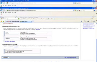
- Show the error message where the customers can see them – What’s the point of showing an error message if the visitors can’t see them. Many sites forget this simple principal. If an error occurs automatically scroll to the error message so that the visitor can see the error message. One of the offenders of this is mighty “Google”. The following form on “Google Website Optimizer” has an error but it is hard to see that error message on the screen.
Have you come across a form validation that drove you nuts? Send me the link. Comments?
--------------------------------------------------------------------------
Looking to fill your Web Analytics or Online Marketing position?
Post your open jobs on Web Analytics Job Board
--------------------------------------------------------------------------


No comments:
Post a Comment
I would like to hear your comments and questions.